GCP Graphs and Data Displays
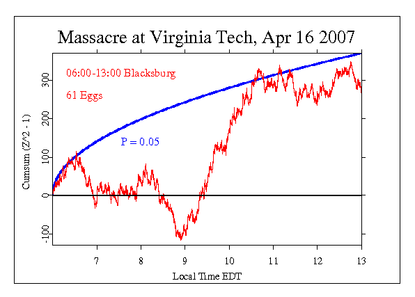
Our most frequent graphical display for the results shows a cumulative deviation
of trial scores from expectation. Each raw score is processed (normalized and squared) to create a well-defined quantity called a Chisquare which can readily be combined and compared. The deviations of these values from their expectation should average to zero in truly random data, but if there is structure in the data, the deviations may accumulate in a consistent positive or negative trend. The length and steadiness of such trends, and more importantly, their correlation with events which have been identified in formal predictions, are indicators of anomalous structure.
Our graphs, such as the one shown below, typically include a smooth curve (blue) showing the criterion for statistical significance (the convention we use is the standard p < 0.05, or 20 to 1 odds that the final accumulated value departs from expectation due to chance). Data traces plotting a steady slope away from the horizontal expectation are unlikely to be just chance fluctuations. The terminal value of the accumulation corresponds to the mean shift and is the value we test against the null hypothesis. If it is outside the envelope, we infer a statistically significant deviation.
Go to the page linked above for a more detailed introduction (including samples of graphical displays.) If you need more explanation, please read the FAQ, and explore the various special topic pages linked from the FAQ page.
The cumulative deviation graph shown below plots the history of the deviations of trial values from their expectation. Thus, if a score is larger than expected, the deviation is positive, and is plotted as an increment. Each new point is plotted relative to the accumulated prior values, so if there is a tendency or bias toward high scores, the trace will have a positive slope. Conversely, if the tendency is to low values the slope will be negative. It is important to understand these are just numerical descriptions, and positive and negative do not have social or psychological meaning in the sense of good and bad.
What is important in interpreting these graphs is consistency and persistence of deviation, which will be seen as steady, long trends. In the example below, the final value is not significantly deviant (it is inside the blue curve), but it is substantial and positive. As one of many replications of our hypothesis test, it contributes to the evidence for a deviation correlated with major events in the world. Going beyond this formal interpretation, we can consider the history itself. There is a period of about two hours, beginning at about 9:00 which has a very strong, smooth slope. (You can get an idea of its strength by visualizing it with the blue significance envelope shifted to start at 9:00.) No formal interpretation can be made, but we can speculate on the question whether the coincidence of this sharp deviation from random behavior with the timing of the Blacksburg shooter’s rampage is meaningful. Such considerations can inform the specification of future hypothesis tests in our ongoing formal replication series.